When life gives you lemons, make lemonade

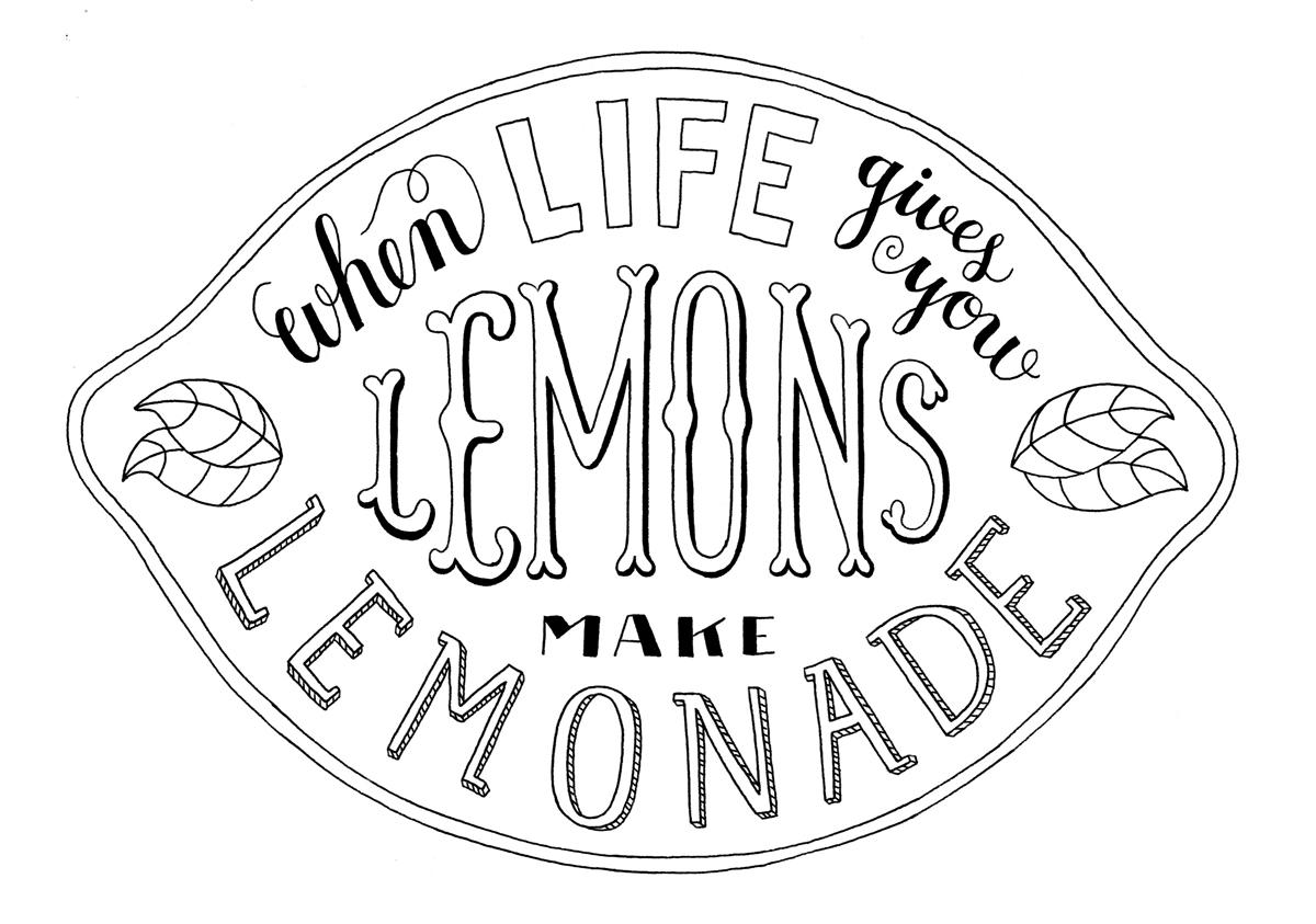
Finally, here is my inked drawing! I tried inking on different kinds of paper with different pens - and retraced it about 7 times at least. I'm very happy with the result, though there are always new improvements I see after every retracing. I used the uni-ball pen for this one, I had never used it before but I definitely see why you recommend it now that I have.
Thank you so much, Mary Kate, for sharing your knowledge! I rewatched your videos several times while I was working on the project, and I especially liked the last one, where we can watch you drawing. The Q&A was also super handy!
(I finished the Final Steps too, if you want to see it in colour: look here! If you like it, you can buy a nice giclee print of my illustration in my Etsy shop.)
_______________________________________________
My brainstorm/sketching/thumbnails/firstdrawings:
# 1 (23.10.13)
Hi! :)
I chose the phrase: When life gives you lemons, make lemonade. I like the phrase because it means 2 different things for me. 1: when life is bad, turn it into a nice thing. 2: when there is an opportunity to grab: grab it! I really like food & cooking. So that's my phrase!
I'm a bit new to hand lettering. I always doodled some letters in my sketchbooks before, but never tried to make something serious. I studied photography but I always loved illustration and hand lettering - without really practicing it, because all my focus was on photography. I graduated almost 1,5 years ago and I found out that I like drawing way more, the way of working feels better for me! And now that I have the time, I would like to become better at hand lettering.
Here is some inspiration for my phrase. I like the freshness and I love the sliced lemons:

And I found these signs, I think I might use them as inspiration in my sketches:

These are (a selection of) the sketches I made so far. Really enjoying it and hope you do too!
(Some of the text is in Dutch, sorry for that!)


# 2 (25.10.13)
Hey there :) I made some thumbnails, and picked the ones I like most (yellow dot). I think I like the one on top the most - but as I'm new to hand lettering, I'm wondering what you guys can tell me at this point. Some feedback would be nice!
(Sorry for the bad picture - have no scanner at the moment and it's already late & dark here in London. Hope it will do for now)

# 3 (04.11.13)
Hi there! Thanks for all your feedback and comments. I made a bigger sketch of the lemon, and am also busy working on a sketch of the glass. So here's the lemon first:

I like the composition, and the way it almost looks like a sign for selling lemons/lemonade. I'm not sure about the word LEMONS, it seems a bit dull for me, or maybe it just doesn't fit, I'm not sure what I don't like about it. I think I will just try some other styles of lettering for LEMON, and see what fits best. What do you guys think? And one thing I have to improve too is the spacing in LEMONADE.
I'm also working on a bigger sketch of the glass, I am still figuring out what composition of the words will work best. I think LEMONADE is too dominant in the sketch below. The curves are a bit tricky, I definitely have to work on that. Oh - do you think WHEN (in the straw) is too much/busy?
I am going to make more sketches now, but in the meanwhile some feedback on these 2 sketches would be nice! Thanks for taking a look at my work :) all the best.

# 4 (12.11.13)
Tried some different styles for the word 'lemon' for my first sketch (the lemon shaped one). I thought the word was a bit too dull, so I tried some fancier styles. I really like the ones on the bottom right (the very lightly sketched O E M L). So my next step is to sketch the lemon-shaped sketch again, this time with a fancier 'lemon' word.

# 5 (15.11.13)
I tried some different styles for the word 'lemon' now and I think I am quite happy with the composition & hierarchy at this point. I traced the drawing in ink just to get a feeling of how it's going to looking like - I'm aware there are some things that can still be improved! But I think I'm going to leave this one for now and focus on my next step, to redraw and improve the 'glass' sketch. If you see anything that can be improved, please tell me :) thanks!


# 6 (19.11.13)
And here is another sketch, this time of the glass. I improved my last sketch of the glass, but this new one still needs improvement. The glass itself is not drawn very nicely, and the spacing is sometimes not so good.
Do you think I should work this sketch out too, just to see which one of the two sketches (lemon - glass) is the best? I prefer the lemon sketch, I think. But I'm wondering what you guys are thinking. And if you like the glass sketch more - what could be improved? Thanks! :)

# 7 (05.12.13)
Here you can see a few of my retracings on different paper and with different pens. I also made a second layer drawing (top right).